The challenge
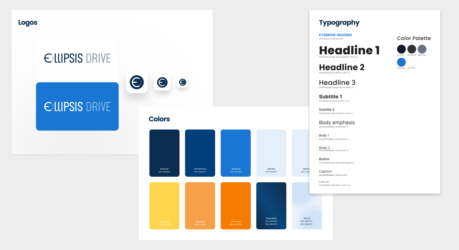
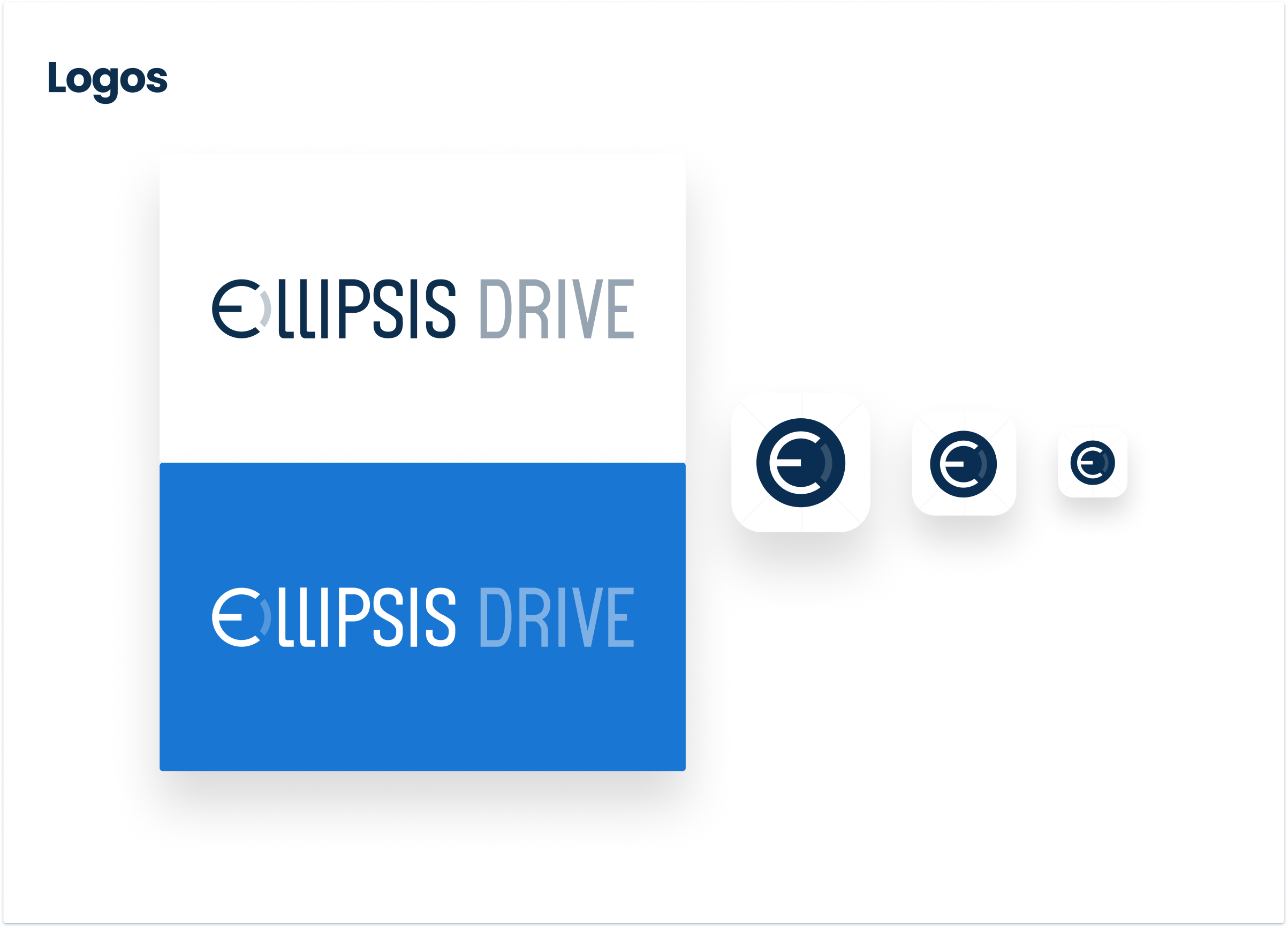
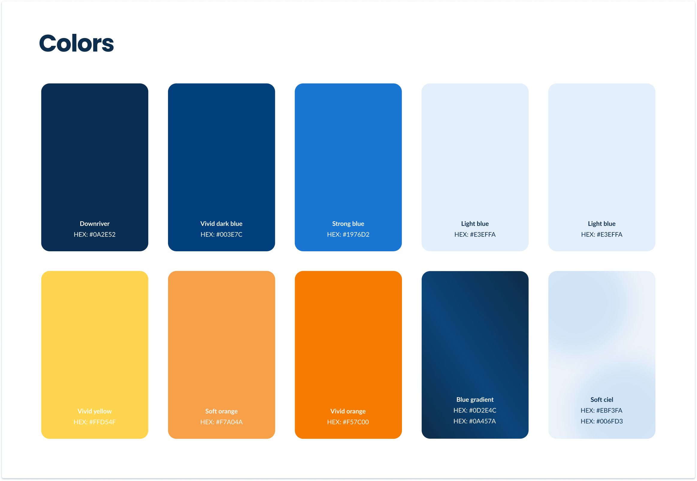
When I joined Ellipsis Drive, the logo and a handful of primary colours existed. Everything else needed to be built.
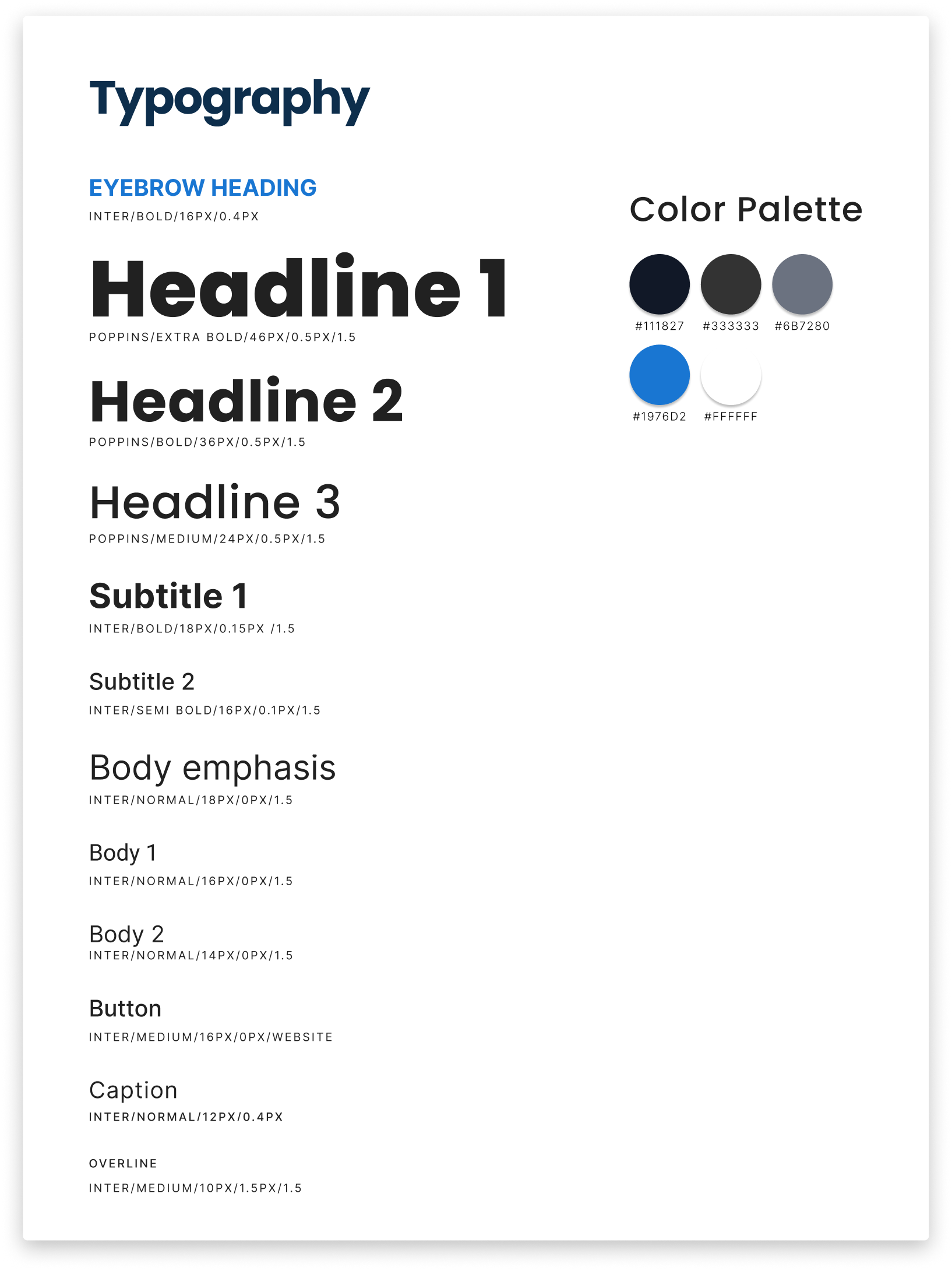
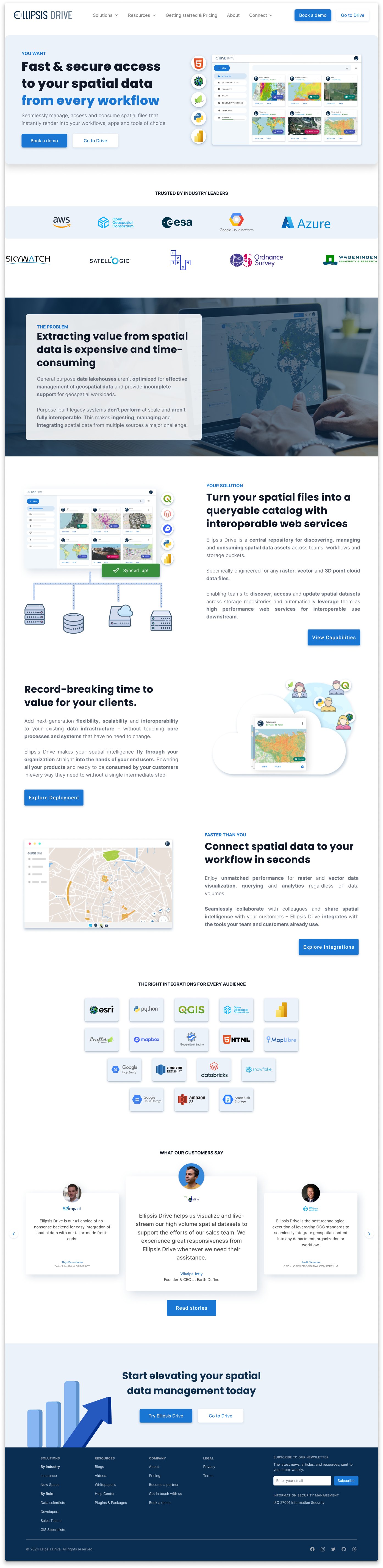
The product was solid and the team was growing, but the visual identity hadn't been developed. There were no rules for typography, no visual system for campaigns, no guidelines for how the company should look or sound across different surfaces. Every new asset was a fresh decision made from scratch.
The goal was to build a brand that felt clean, fresh, and trustworthy. One that could look unique and stand out in front of technical decision-makers without looking like every other SaaS company.