The Pricing page
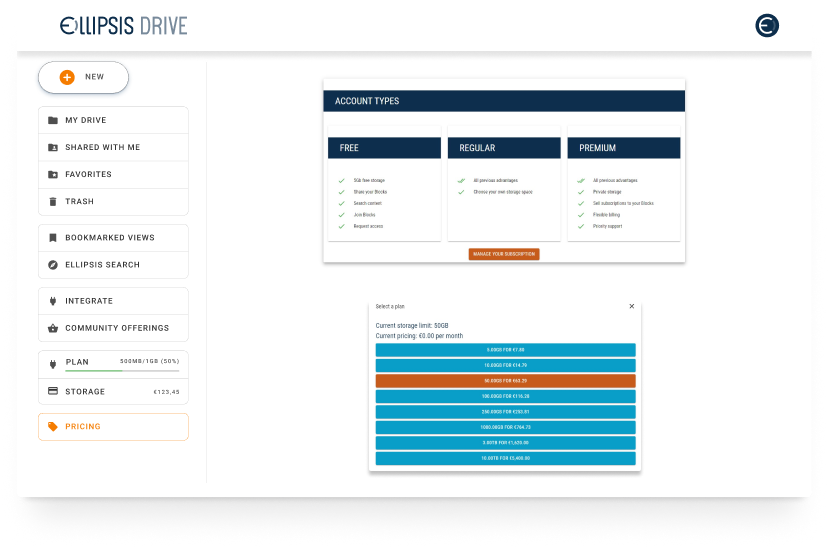
The original pricing page was built inside the app by a developer. Three plan columns, a feature list, and a modal for storage selection. No visual hierarchy, no clear recommended option, nothing to guide a user toward a decision.
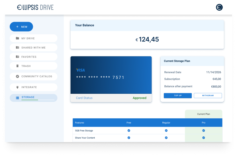
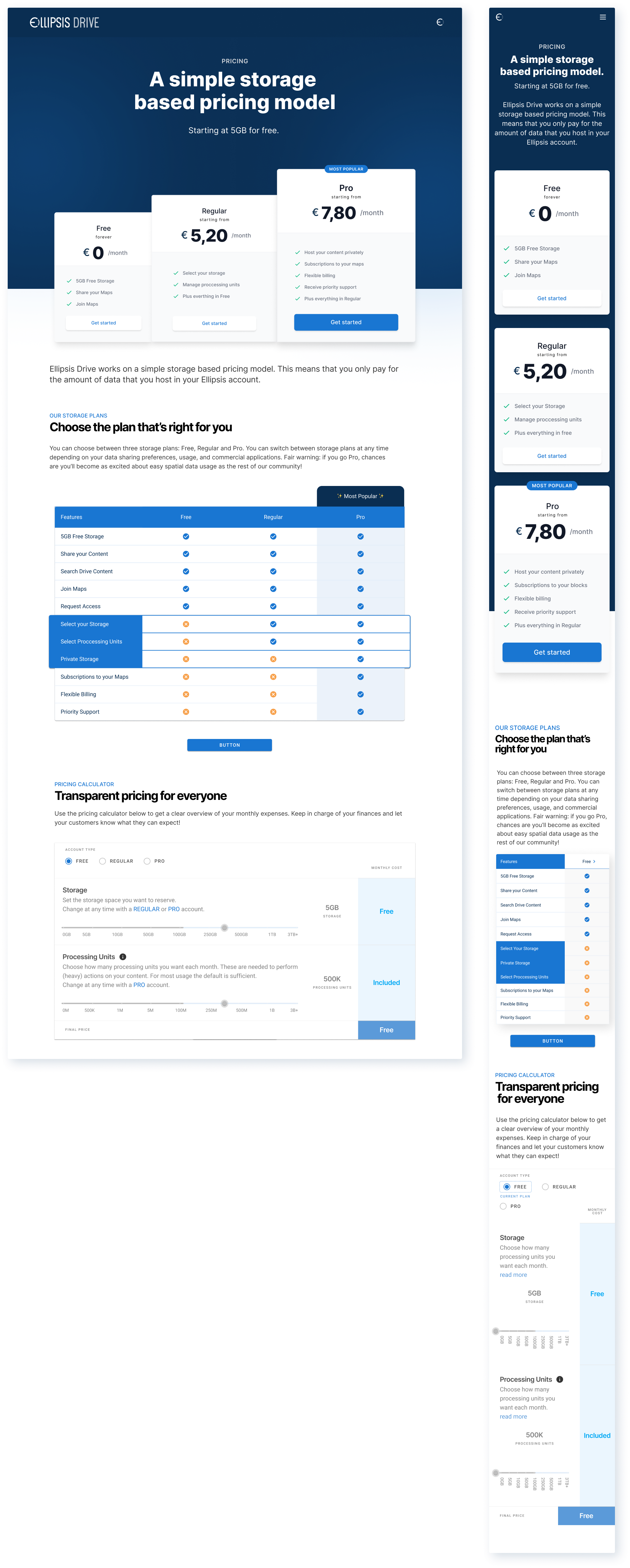
The redesign turned it into a proper conversion page. The three pricing tiers now have visual weight, with Pro elevated as the recommended plan. A full feature comparison table lets users see exactly what they're getting at each level. The pricing calculator was a new addition, letting users set their own storage and processing needs and see the cost update in real time. The page was also designed responsively from the start.