How I built a full-funnel acquisition system for a technical SaaS product nobody had heard of
What this covers
Campaign strategy
Campaign strategy
Ads Design
Content Design
Motion Design
Landing page Design
Email Marketing
The challenge
Ellipsis Drive is a spatial data platform with a strong product and a real market. The challenge was simple: the right people hadn't heard of it yet.
Those people were product managers building spatial data products, tech leads managing spatial data infrastructure, and data science leaders who work with spatial data every day. They can spot generic messaging from a mile away. If the message doesn't reflect their world, they're gone in two seconds.
My job was to make Ellipsis Drive visible and credible to this audience, from the first impression to a signed-up user.
The impact
1,138,067 total marketing impressions in 2025 across LinkedIn, newsletter, and organic traffic
Organic impressions grew 34% year over year, from 306,930 to 412,860.
Sign-up interest and trial activity are tracked directly to feature launch campaigns.
How we got there
I am showcasing here the case of launching a new feature
Campaign: Ellipsis Map Engine Launch
Launching the Map Engine wasn't just an announcement. It was a positioning problem: how do you make a complex feature feel immediately relevant to someone scrolling past it on LinkedIn?
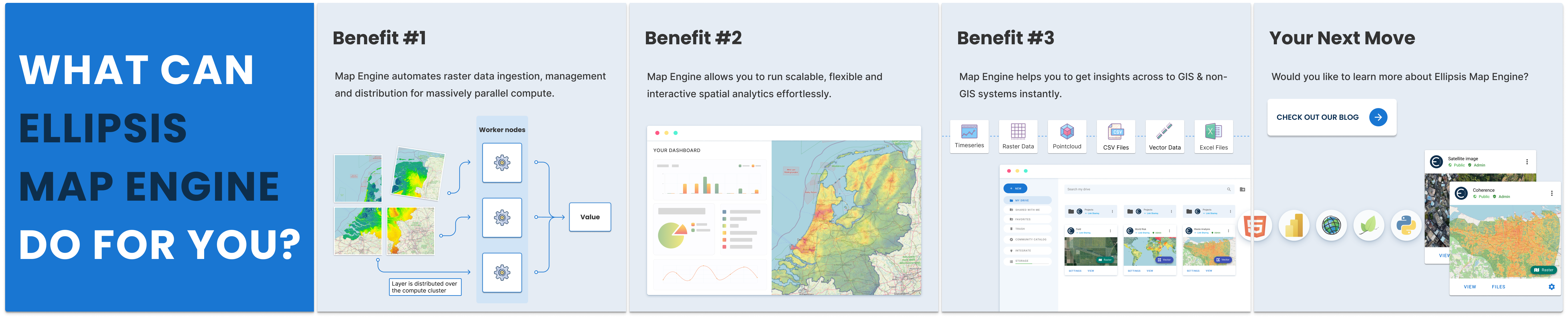
The answer was to lead with the workflow change, not the feature name. I designed a static ad and a carousel post for the same campaign, each built for a different type of attention. Both used the actual product interface in the creative, so technical users could instantly recognise the context and decide whether it is for them.
LinkedIn Ad for Ellispis Map Engine
Carousel post for Ellipsis Map Engine
Metrics
Ad Name
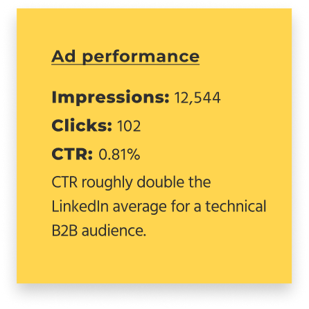
Impressions
Clicks
CTR
Key Results
What can Ellipsis Map Engine do for you?
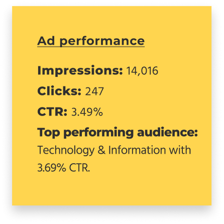
14,016 (48%)
247 (50.51%)
3.69%
489 Engagements
What the data told us
The document carousel outperformed the static ad by 4x on CTR. For a technical audience, depth beats flash. A carousel that walks someone through a concept gives them a reason to engage. A static image can stop the scroll, but it rarely closes the argument on its own.
The lesson: lead with education, not awareness. For this audience, the content is the creative. A well-structured document ad that explains a concept or solves a problem will consistently outperform a polished static image that asks someone to click through to learn more.
Ad to Landing Page Without Losing People
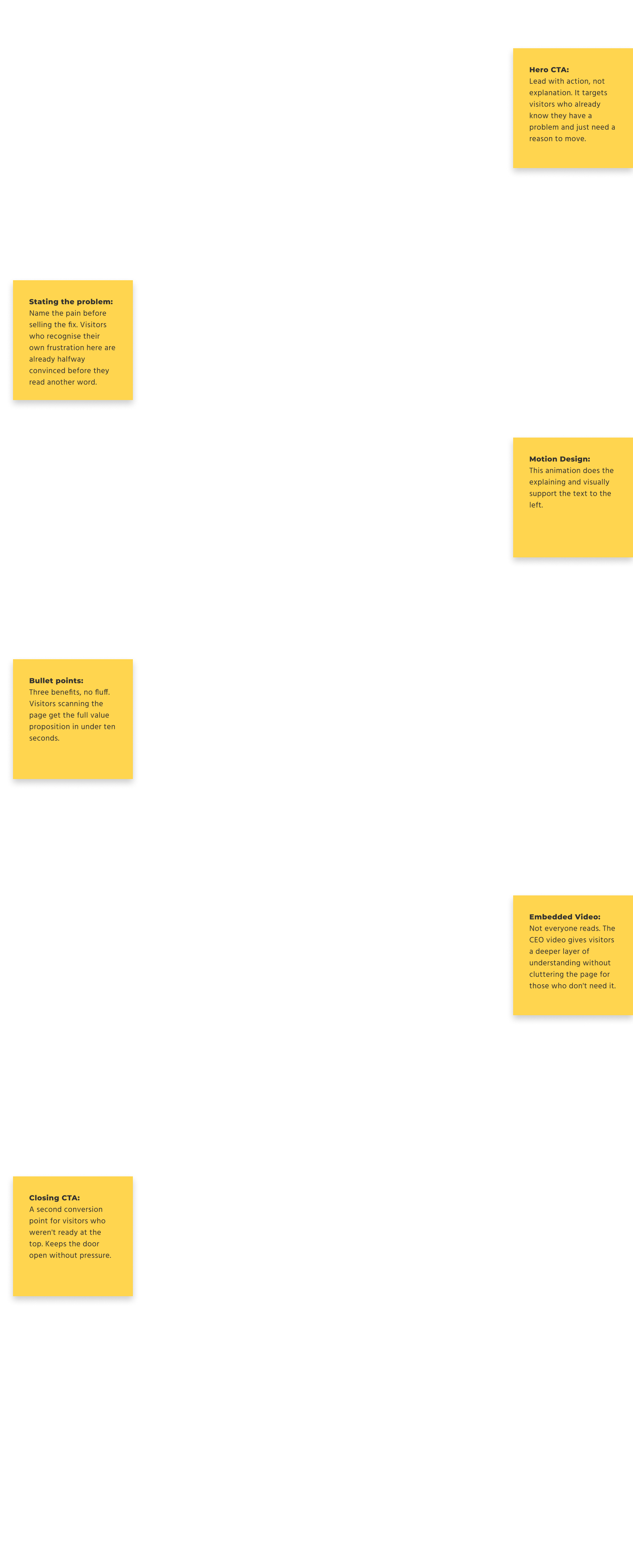
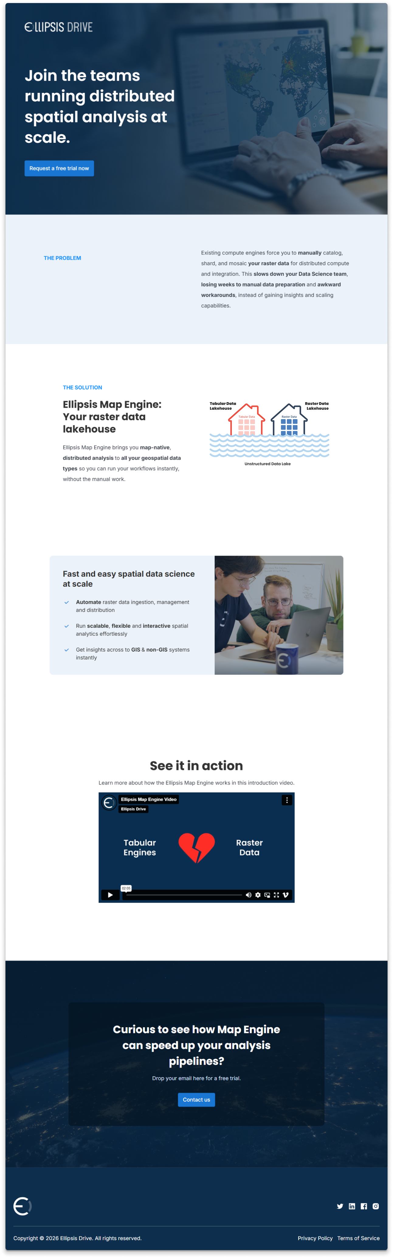
Most campaigns lose momentum right here. The ad promises one thing, the landing page delivers something slightly different, and the user quietly closes the tab. For the Map Engine launch, I designed the landing page as a direct continuation of the ad: same visual logic, same headline angle, same product framing. Someone arriving from LinkedIn shouldn't feel like they've been handed off to a different team. For visitors who wanted to go deeper, I added a video of the Ellipsis Drive CEO explaining how the feature works, paired with custom animations visualising the technology behind it. Not everyone reads. Some people need to see it move, or hear it from the person who built it. You can see the landing page here.
LinkedIn Ad for Ellispis Map Engine
Landing Page for Ellipsis Map Engine
Conversion & Retention: Email Campaigns
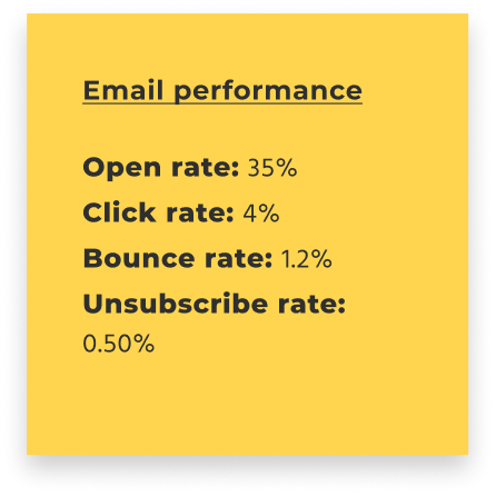
The emails had two jobs: bring back people who'd seen the ads but hadn't signed up, and give existing users a reason to care about the new feature. I led each email with the Map Engine's core value. Each email linked directly to the landing page for those who wanted to go further, and included the CEO video for anyone who needed more than a headline to be convinced.
Product Update Email
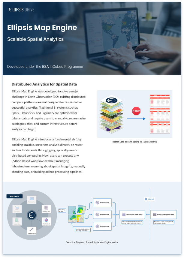
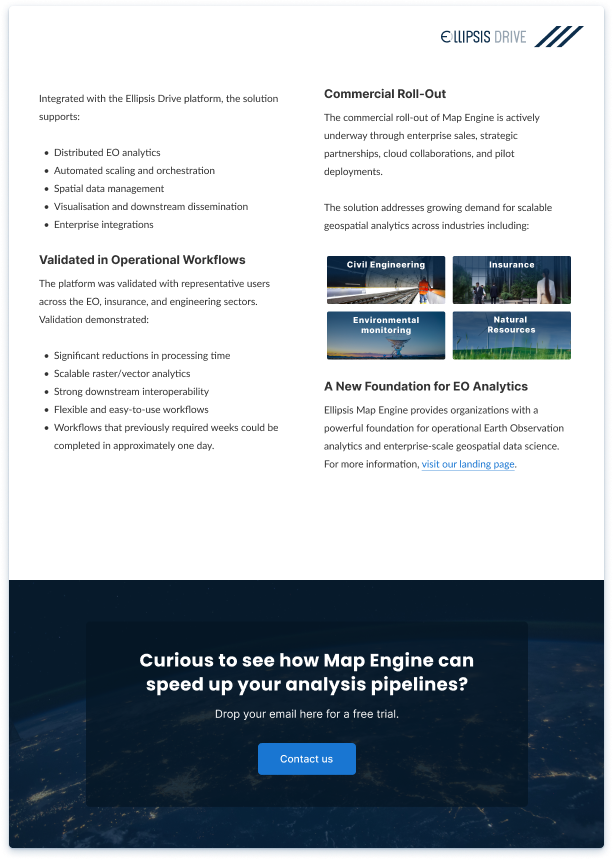
Additional Material: Ellipsis Map Engine Brochure
Not every deliverable lives on a screen. This brochure was designed as part of a proposal submission to ESA, one of the largest geospatial organisations in the world, to present the Map Engine as a viable solution for scalable Earth Observation analytics.
The brief required translating deeply technical content into a document that could hold its own in a formal proposal context: clear structure, credible visual language, and enough technical depth to satisfy an expert audience without losing the thread. The brochure covers the product's distributed analytics architecture, validated operational workflows, and its commercial rollout across industries including civil engineering, insurance, and environmental monitoring. Designing for ESA meant zero margin for vagueness. Every diagram, every headline, and every layout decision had to earn its place.
Want to create something together?
Whether you have a project in mind or want to discuss design trends, I'm here to listen and collaborate. Feel free to reach out!